Debiased metrics calculation user guide
Table of Contents
Load and preprocess data: Kion
Train / test split
What is debiasing of test interactions?
Original test items frequency distribution
Debiased test items frequency distribution
Application of debiased metrics on Kion dataset
Prepare metrics
Prepare and fit models
Calculate and visualize metrics
Metrics trade-off analysis: why do we need debiased metrics?
MAP vs Serendipity trade-off
Debiased MAP
visuals extension for rectools is required to run this notebook. You can install it with pip install rectools[visuals]
kaleido package is required to render widgets outputs in png format. You can install it with pip install kaleido
[2]:
import os
import threadpoolctl
from pathlib import Path
import warnings
from copy import deepcopy

warnings.filterwarnings("ignore")

import pandas as pd
import numpy as np
import seaborn as sns
from matplotlib import pyplot as plt

from rectools.metrics import MAP, calc_metrics, Serendipity
from rectools.models import ImplicitALSWrapperModel, PopularModel, ImplicitItemKNNWrapperModel
from rectools import Columns
from rectools.dataset import Dataset
from rectools.metrics import debias_interactions, DebiasConfig, HitRate, AvgRecPopularity, Intersection
from implicit.als import AlternatingLeastSquares
from implicit.nearest_neighbours import BM25Recommender

try:
    from rectools.visuals import MetricsApp
except ImportError:
    print("\033[91m `visuals` extension for `rectools` is required. You can install it with `pip install rectools[visuals]`")

sns.set_theme(style="whitegrid")
sns.set(rc={'figure.figsize':(15, 5)})
sns.set_context("paper", rc={"font.size":18,"axes.titlesize":18,"axes.labelsize":14,
                            "xtick.labelsize": 14, "ytick.labelsize": 14})

# For implicit ALS
os.environ["OPENBLAS_NUM_THREADS"] = "1"
threadpoolctl.threadpool_limits(1, "blas")
[2]:
<threadpoolctl.threadpool_limits at 0x10473fb50>
Load and preprocess data: Kion
[53]:
%%time
!wget -q https://github.com/irsafilo/KION_DATASET/raw/f69775be31fa5779907cf0a92ddedb70037fb5ae/data_original.zip -O data_original.zip
!unzip -o data_original.zip
!rm data_original.zip
Archive:  data_original.zip
  inflating: data_original/interactions.csv
  inflating: __MACOSX/data_original/._interactions.csv
  inflating: data_original/users.csv
  inflating: __MACOSX/data_original/._users.csv
  inflating: data_original/items.csv
  inflating: __MACOSX/data_original/._items.csv
CPU times: user 1.82 s, sys: 411 ms, total: 2.23 s
Wall time: 1min 40s
[229]:
DATA_PATH = Path("data_original")

users = pd.read_csv(DATA_PATH / 'users.csv')
items = pd.read_csv(DATA_PATH / 'items.csv')
interactions = (
    pd.read_csv(DATA_PATH / 'interactions.csv', parse_dates=["last_watch_dt"])
    .rename(columns={"last_watch_dt": Columns.Datetime})
)
interactions[Columns.Weight] = 1
Train / test split
[230]:
max_date = interactions[Columns.Datetime].max()
train = interactions[interactions[Columns.Datetime] < max_date - pd.Timedelta(days=7)].copy()
test = interactions[interactions[Columns.Datetime] >= max_date - pd.Timedelta(days=7)].copy()
cold_users = set(test[Columns.User]) - set(train[Columns.User])
test.drop(test[test[Columns.User].isin(cold_users)].index, inplace=True)
test_users = test[Columns.User].unique()
catalog=train[Columns.Item].unique()
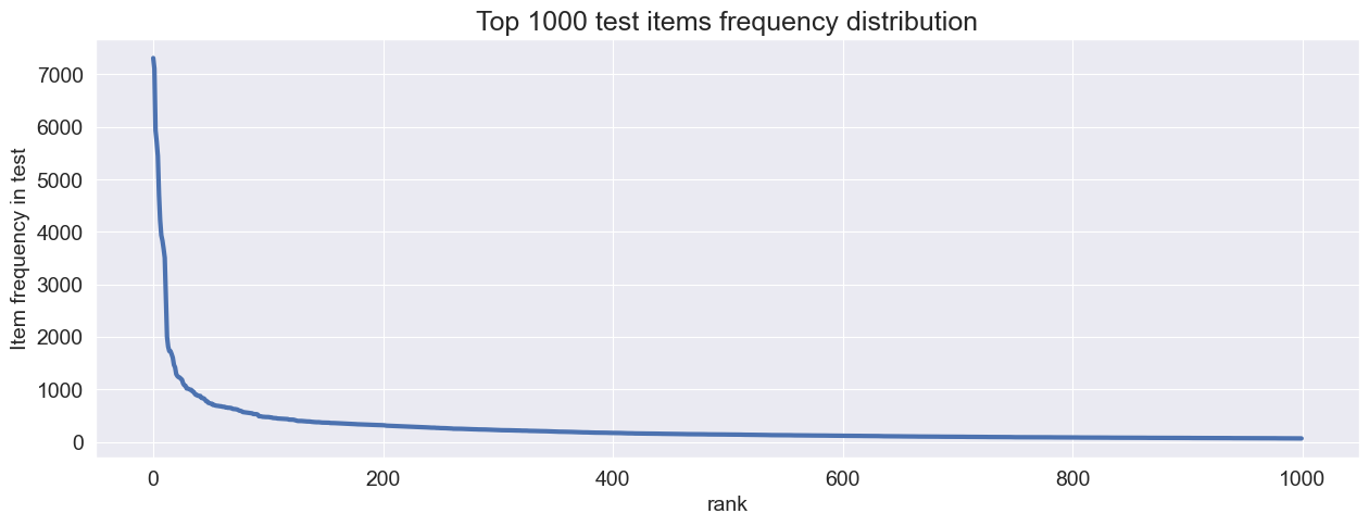
What is debiasing of test interactions?
Let’s look at the test items frequency distribution lineplot and boxplot
[231]:
def plot_linelot(test, threshold=150):
    item_test_counts = test[Columns.Item].value_counts().reset_index()
    top_item_test_counts = item_test_counts.head(threshold)
    top_item_test_counts["rank"] = np.arange(threshold)
    bplot = sns.lineplot(data=top_item_test_counts, x='rank', y='count', linewidth=3)
    bplot.set_title(f'Top {threshold} test items frequency distribution')
    bplot.set_ylabel('Item frequency in test')

plot_linelot(test, 1000)
[232]:
def plot_boxplot(test, color: str="blue"):
    plt.figure(figsize=(4,4))
    item_test_counts = test[Columns.Item].value_counts().reset_index()
    boxplot = sns.boxplot(data=item_test_counts, y='count', color=color)
    boxplot.set_title(f'All test items frequency distribution boxplot')
    boxplot.set_ylabel('Item frequency in test')


plot_boxplot(test)

We have extreme outliers in test frequency. This is qutie common in many real life services data.
All classification and ranking metrics will be sensitive to such test distributions. Models that often recommend overly-frequent test items (like Popular model or other models with popularity bias in recommendations) will “win” on TruePositive based metrics.
It is common in real-life services that researcher doesn’t want those extremely frequent outlier test items to overwhelm TruePositive-based metrics for models with populariry bias.
This is the main motivation for debiasing test interactions.
Let’s downsample test user interactions with overly-frequent items so that we will not have any outliers in test data. Let’s follow the boxplot logic and use Itra-Quartile Range for this. For debiasing we can specify IQR coefficent to calulate the maximum allowed test item frequency. No item should have test interactions count above this border. Just like in classic boxplot logic.
We are not changing train data at all. We just want to create a validation protocol that will not be affected by outliers in test interactions.
[233]:
# Downsample outliers item interactions from test using rectools
debiased_test = debias_interactions(test, config=DebiasConfig(iqr_coef=1.5, random_state=32))
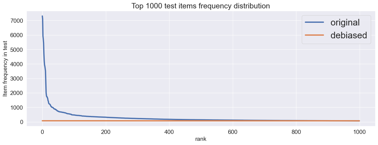
Let’s see what’ changed in test interactions after debiasing
[234]:
def plot_linelot_compared(test, debiased_test, threshold=150):
    fig, ax = plt.subplots(ncols=1)
    item_test_counts = test[Columns.Item].value_counts().reset_index()
    top_item_test_counts = item_test_counts.head(threshold)
    top_item_test_counts["rank"] = np.arange(threshold)
    bplot = sns.lineplot(data=top_item_test_counts, x='rank', y='count', ax=ax, linewidth=3, label="original")
    bplot.set_title(f'Top {threshold} test items frequency distribution')
    bplot.set_ylabel('Item frequency in test')
    item_test_counts_deb = debiased_test[Columns.Item].value_counts().reset_index()
    top_item_test_counts_deb = item_test_counts_deb.head(threshold)
    top_item_test_counts_deb["rank"] = np.arange(threshold)
    sns.lineplot(data=top_item_test_counts_deb, x='rank', y='count', ax=ax, linewidth=3, label="debiased")
    plt.legend(fontsize='large')

plot_linelot_compared(test ,debiased_test, 1000)
[235]:
plot_boxplot(debiased_test, color="darkorange")

There are no outliers anymore.
Now we have 2 variants of test inteactions: classic test and it’s down-sampled, debiased version. We can calculate any TruePositive-based metric on any variant of test interactions. Let’s see how it’s done in practice.
Application of debiased metrics on Kion dataset
In rectools we have debias mechanism inside all of the appropriate metrics. So there is no need for manual debiasing of test interactions.
To apply debiasing during metrics calculation you just need to specify debias_config during metric’s initialization.
Prepare metrics
[236]:
metrics = {
    'Serendipity': Serendipity(k=10),
    'MAP': MAP(k=10),
    'MAP_debiased': MAP(k=10, debias_config=DebiasConfig(random_state=32, iqr_coef=10)),  # debiased version of MAP
}
Prepare and fit models
[237]:
K_RECOS = 10
NUM_THREADS = 32
RANDOM_STATE = 32
ITERATIONS = 10
[238]:
# Prepare ALS models

def make_als_model(factors: int, regularization: float=0.5, alpha: float=10, fit_features_together: bool=False):
    return ImplicitALSWrapperModel(
        AlternatingLeastSquares(
            factors=factors,
            regularization=regularization,
            alpha=alpha,
            random_state=RANDOM_STATE,
            use_gpu=False,
            num_threads = NUM_THREADS,
            iterations=ITERATIONS),
        fit_features_together = fit_features_together,
    )
factors_options = (32, 64, 128)
als_models = {
    f"als_{factors}": make_als_model(factors) for factors in factors_options
}
[239]:
# Prepare ItemKNN models

from itertools import product

k_options = (20, 200)
k1_options = (0.1, 3, 5)
b_options = (0.1,)

bm25_models = {
    f"bm25_{k}_{k1}_{b}": ImplicitItemKNNWrapperModel(
        BM25Recommender(k, k1, b)) for k, k1, b in product(k_options, k1_options, b_options)
}
[240]:
# Prepare popular model

from datetime import timedelta
models = {"popular": PopularModel(period=timedelta(days=14))}
models.update(als_models)
models.update(bm25_models)
models
[240]:
{'popular': <rectools.models.popular.PopularModel at 0x1673abd60>,
 'als_32': <rectools.models.implicit_als.ImplicitALSWrapperModel at 0x2969473d0>,
 'als_64': <rectools.models.implicit_als.ImplicitALSWrapperModel at 0x1603e7400>,
 'als_128': <rectools.models.implicit_als.ImplicitALSWrapperModel at 0x1603e45e0>,
 'bm25_20_0.1_0.1': <rectools.models.implicit_knn.ImplicitItemKNNWrapperModel at 0x296945f60>,
 'bm25_20_3_0.1': <rectools.models.implicit_knn.ImplicitItemKNNWrapperModel at 0x1603540a0>,
 'bm25_20_5_0.1': <rectools.models.implicit_knn.ImplicitItemKNNWrapperModel at 0x160354f10>,
 'bm25_200_0.1_0.1': <rectools.models.implicit_knn.ImplicitItemKNNWrapperModel at 0x160355000>,
 'bm25_200_3_0.1': <rectools.models.implicit_knn.ImplicitItemKNNWrapperModel at 0x1603567d0>,
 'bm25_200_5_0.1': <rectools.models.implicit_knn.ImplicitItemKNNWrapperModel at 0x160354670>}
[241]:
# %%time
dataset = Dataset.construct(
    interactions_df=train,
)
for model in models.values():
    model.fit(dataset)
Calculate and visualize metrics
[242]:
# Collect model metrics values
recos = {
    model_name: model.recommend(k=10, users=test_users,dataset=dataset, filter_viewed=True) for model_name, model in models.items()
}
res = []
for model_name, reco in recos.items():
    model_metrics = calc_metrics(metrics, recos[model_name], test, train, catalog)
    model_metrics.update({"model": model_name})
    res.append(model_metrics)
models_metrics = pd.DataFrame(res)

# Collect model types for visualization
als_model_types = [{"model": model_name, "model_type": "als"} for model_name in als_models.keys()]
bm25_model_types = [{"model": model_name, "model_type": "bm25"} for model_name in bm25_models.keys()]
model_types = [{"model": "popular", "model_type": "popular"}] + als_model_types + bm25_model_types
models_meta = pd.DataFrame(model_types)
[4]:
# When you run this notebook, the output of this cell will have an interactive widget for metrics trade-off analysis

app = MetricsApp.construct(models_metrics, models_meta)
Metrics trade-off analysis: why do we need debiased metrics?
Please note that we’ve taken MAP as an example of a TruePositive-based metrics. But logic will be the same for any other classification or ranking RecSys metric.
[5]:
# Code in this cell is only needed fow drawing circles to highlight winnig models
# You don't need it in your research

target_metrics = ["MAP", "Serendipity", "MAP_debiased"]
leader_models = {}
for target_metric in target_metrics:
    leader_model_values = models_metrics.sort_values(target_metric).tail(1)
    leader_models[target_metric] = {}
    for metric in target_metrics:
        leader_models[target_metric][metric] = leader_model_values[metric].iloc[0]

def get_leader_scatter_kwargs(leading_metric, x_metric, y_metric):
    leader_colors = {
        "MAP": "Green",
        "Serendipity": "Blue",
        "MAP_debiased": "Red"
    }
    res = {
        "x": [leader_models[leading_metric][x_metric]],
        "y": [leader_models[leading_metric][y_metric]],
        "marker": dict(size=40, color=leader_colors[leading_metric], opacity=0.2),
        "showlegend": False
    }
    return res
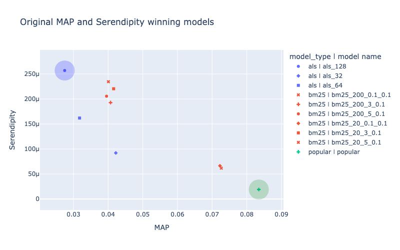
MAP and Serendipity usually have negative correlation for models that already show descent quality.
To choose a model for usage in real-life service it is necessary to choose a model that shows maximum MAP metric value (here it is popular model, highlighed in green circle). Or a model that shows maximum Serendipity value (like als_128 model, highlighted in blue circle).
Another option is to look at the scatter-plot and choose some other model that is within pareto-optimal deсisions (like some of the bm-25 models coloured in red).
[6]:
# For this plot `MAP` and `Serendipity` metrics were chosen in interactive MetricsApp widget
# Metadata colouring was enabled

fig = deepcopy(app.fig)
fig.update_layout(title="Original MAP and Serendipity winning models")
fig.add_scatter(**get_leader_scatter_kwargs("MAP", "MAP", "Serendipity"))
fig.add_scatter(**get_leader_scatter_kwargs("Serendipity", "MAP", "Serendipity"))
fig.show("png")
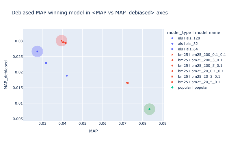
Choosing a model from pareto-optimal decisions sounds reasonable but it doesn’t give a researher one single optimization goal for hyper-params tuning and final model selection.
Debiased variant of metric (like debiased MAP) can serve as a single optimization goal for hyper-params tuning and best model selection. Models that are selected based on debiased metric value can be quite different from those that optimize origial metric (like MAP) and also quite different from those that optimize Serendipity.
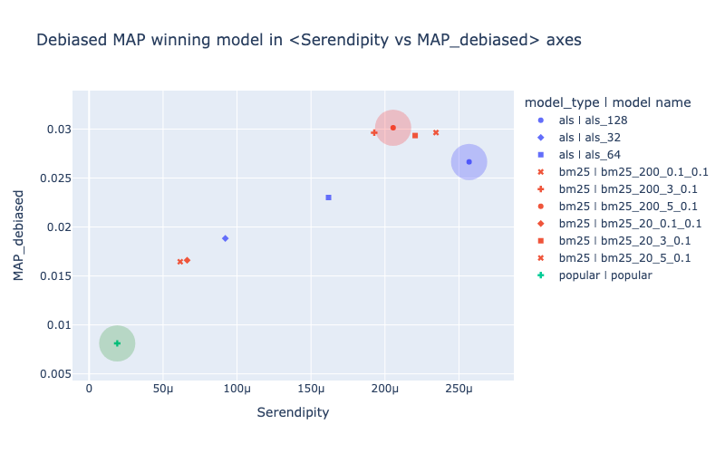
On the picture below the red-colored bm25 model has the highest debiased MAP value. It could be declared a winner based on this level of downsampling of test interactions.
[8]:
# For this plot `MAP` and `MAP_debiased` metrics were chosen in interactive MetricsApp widget
# Metadata colouring was enabled
fig = deepcopy(app.fig)
fig.update_layout(title="Debiased MAP winning model in <MAP vs MAP_debiased> axes")
fig.add_scatter(**get_leader_scatter_kwargs("MAP", "MAP", "MAP_debiased"))
fig.add_scatter(**get_leader_scatter_kwargs("Serendipity", "MAP", "MAP_debiased"))
fig.add_scatter(**get_leader_scatter_kwargs("MAP_debiased", "MAP", "MAP_debiased"))
fig.show("png")
[9]:
# For this plot `Serendipity` and `MAP_debiased` metrics were chosen in interactive MetricsApp widget
# Metadata colouring was enabled

fig = deepcopy(app.fig)
fig.update_layout(title="Debiased MAP winning model in <Serendipity vs MAP_debiased> axes")
fig.add_scatter(**get_leader_scatter_kwargs("MAP", "Serendipity", "MAP_debiased"))
fig.add_scatter(**get_leader_scatter_kwargs("Serendipity", "Serendipity", "MAP_debiased"))
fig.add_scatter(**get_leader_scatter_kwargs("MAP_debiased", "Serendipity", "MAP_debiased"))
fig.show("png")
Note that required level of downsampling is quite different between different services. To change the level of downsampling researcher needs to specify desired IQR coefficient in debias_config during metric’s initialization.